We've done a lot of changes so far, but there are still a few more to go. I'm still doing some redesigning of the blog but don't worry we'll be back soon with new updates from The Loft.
STAY TUNED!!!!

Monday, August 30, 2010
Sunday, August 22, 2010
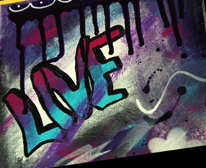
Change is a good thing!!!
We are making some changes to the Blog, so please pardon our dust during reconstruction.
We'll be back with new posts soon.
Thanks for your support, and we hope to see you back soon!
We'll be back with new posts soon.
Thanks for your support, and we hope to see you back soon!
Wednesday, August 18, 2010
What's new at The Loft - Episode 31
Greetings All,
As some of you may know my crafting background is varied. One of my real passions (although I haven't had the time or the workspace to do it lately) is miniatures. Which is why every year at the end of July I attend the Lakeland Dollhouse and Miniature show, put on by the Lakeland Miniature Guild. This annual event is one of the best shows in the area and I love going to see all the great things the vendors have to offer and to see and be inspired by all the projects on display. I took lots of great pictures but sadly I lost all of them due to my unfamiliarity with the how the mini SD card in my camera phone works. I was very upset by this fact especially since I purchased a room box project kit, and took many photos of the examples on hand so I could be inspired for my own spin on the project. It was of a really great 2 story contemporary loft room box with garden style terrace. However while I can't show you any of the photographs I took of some of the completed room boxes done by guild members, I was able to at least go to the Lakeland Miniature Guild's website so I could download pictures of some incomplete projects that will aid me in construction. Here's what the kit looks like after it's put together but before any decoration is added. (Sorry the guild didn't even take these in color)
Here's the exterior

 Here's the interior
I had vowed to not buy anything at the show this year but as soon as I saw this I I fell in love with it. I was good though as I didn't buy anything else at the show this year. However coming home with another project kit didn't make my husband too happy.
I'll have to try to remember to post some pictures from some of my past completed miniature projects.
ATC 3.6.5. Challenge
*** Disclaimer on digital ATC cards***. Most, but not all of the digital ATC's here were done with images found openly on the Internet for my own personal enjoyment. I do not own the photos and they have not been reproduced or sold in anyway.


Well that's all for today. I hope you have enjoyed what you have seen. As always comments are welcome so please feel free to drop me a line and let me know what you think. Thanks for stopping by and please come back soon!
Thursday, August 12, 2010
What's new at The Loft - Episode 30
Hi Everyone,
Summer is almost over at The Loft and things have been pretty crazy trying to get ready for school. School of course then leads to the subject of kids. I am very blessed and fortunate to have 2 beautiful and wonderful daughters. This is also a time when I begin to reflect on how time has gone by so quickly. My older daughter who it seems like yesterday was starting school, is now starting high school, and my baby is now going into second grade. Where has the time gone? It has gone by too fast!
DAUGHTER #1 BEDROOM REDECORATION UPDATE
We had faced some set backs in getting the room done, namely in the way of a new bed and furniture, but now that is complete (pictures to come) so now I've moved on to the fun stuff, the accessories! Sometimes I think my family just humors me with my different modes of creative expression, and that they tolerate this need I have to do something creative to make me happy. So when I asked my daughter if I could create a piece for her room, I got the typical unenthusiastic "sure" reply. What I didn't expect was the unprompted and enthusiastic "This is really cool" I got from my oldest daughter when I was working on it, and when it was finished.


ATC 3.6.5. Challenge
*Disclaimer on digital ATC cards. Most, but not all of the digital ATC's here were done with images found openly on the internet for my own personal enjoyment. I do not own the photos and they have not been reproduced or sold in anyway.
 7/1 "Beach Babe" Anyone who knows me knows how much I love Graphic 45 paper. The images on the paper are fantastic for making ATC's like this one here made from the "Bathing Beauties" paper from their "On the Boardwalk" collection.
 7/2 ""So Many Men, So Little Time" - A great source of vintage images are the old Saturday Evening Post covers, which reflect a more simple and innocent time in our history. For this card I've digitally altered it to fit a slightly more mature theme. One of my biggest hangups when doing digital cards however is the font to use if I put any text on the card at all. Sometimes when I do digital cards I only want the image, with no text or titles so the viewer can form their own thoughts on what the image is trying to convey. However when I feel text is necessary the font is what keeps me from getting a card done in a short time. I have so many fonts that I find it hard sometimes to choose just the right one. For this card I used 2 fonts, a typewriter font at the top, and a more fun font of the letters inside of clocks, which plays on the word time itself.
 7/3 "The Fortune Teller" This was a failed experiment. I was trying to add texture and age to this neat image cut from the French perfume bottle label stickers my husband brought me back from a trip to San Diego he took. After I put a layer of color on the background using my Neo II watercolor crayons and let dry, I peeled the backing off the sticker and adhered it to the background color. I gave it a little time for the glue of the sticker to take hold and then put a layer of Ranger Tim Holtz Rock Candy crackle paint. The crackly paint did not like the watercolor paint or the coating on the stickers which began to crack and flake off. Of course with the crackle paint you want the crackle but not the flakes, which is of course why I call this a failed experiment.
 7/4 " "The Bubble" I found this great B&W image on the internet of the girl holding this glass ball, and though it would be such fun to play with it. I had so many ideas on what to put inside the bubble but settled on an image I found online of a ballet dancer in a bright red leotard.
 7/5 "Barbie" I found a great B&W close up image of a girl whose face reminded me of a doll. I colorized the image slightly and then added an effect to it that made it look like a watercolor painting. When I was done I it reminded me of the poster for Les Miserables.
 7/6 "Princess" I really love this card, made using the new Designs by Reminisce "Fairy Tales" collection of paper that I piece cut together. The background is blue Neo II watercolor crayon and I hand doodled the title.
 7/7 "Her Majesty" I loved this great photo my husband took of our youngest daughter Cassidy when they visited the Children's Museum of Charleston, when we were on vacation. Cassidy loved the museum, especially all the dress up clothes they had. The only thing that was missing was the crown, which I added in digitally.
 7/8 "Elegant Lady" I made this card using a variety of Tweety Jill collage packs including the "Ladies in Hats", "Travel to Paris" and the "Poultry Party" background paper packs. I layered the background papers before putting the woman's image on top. I then added some single buttons and one stacked button for added embellishment.
 7/9 "Doodled Flower" This a hand doodled card made drawn on an image of red and blue Neo II watercolor crayon images. The flower was doodled using a combination of different colored Zig markers and a gold metallic pen.
 7/10 "Dreamer" - I made this card using the Tweety Jill "Fashion" collage pack, with images taken from the "Travel to Paris" collage pack and the background taken from the "Poultry Party" background paper pack.
 7/11 "Dictionary Flower" I made this card by taking pages from an old dictionary and tearing them glueing and layering them in various directions as a collaged background. I then painted over the background with a light layer of a white paint wash, so you could still see the text. When dried I hand drew the flower using Portfolio water soluble oil pastels, then using a scrap of dictionary page scrunched for the center of the flower. I love flowers and use them quite a bit in my ATC's.
 7/12 "Winter Bride" - I enlarged this digital card a bit so you could see it better. I really love the way this card came out. I started with a color image of a bride standing mid profile in a park. I converted the picture to black and white and then added some fill layers an texture layers. I then went back and added several layers of red at different opacity levels to give the flowers more dimension.
 7/13 "Babe" I used this iconic image of Marilyn Monroe as the inspiration for today's card. I used a free paper sample from Stampington as the background and hand painted the word babe on it using black "Basics" acrylic paint. I then detail cut the image of Marilyn out of a poster catalog and adhered her to the top with pop up foam dots.
 7/14 "A Walk at Night" This was another interesting image that I found on the internet that was actually part of a trilogy of images. I really loved what I was able to accomplish with this image, mainly by taking a smoothed surface of the dress and giving it a ruffled look by adding a plastic wrap effect to it before colorizing it. I then cut out the original sky and added my own starry night sky.
 7/15 "Rosebud Made of Hearts" I had just bought a new medium sized heart punch and wanted to see what I could do with it. I started the card by putting down a light watercolor wash on the background with my Neo II watercolor crayons. I then punched several hearts out of red paper and began rolling and gluing then until I formed the rosebud. I then flattened it a bit for gluing it to the background. Once dried I hand stitched the stem and leaves.
Well that is all I have for today. As always your comments are welcome, so please feel free to send me a note and tell me what you think. Thanks for stopping by and please come back soon.
Summer is almost over at The Loft and things have been pretty crazy trying to get ready for school. School of course then leads to the subject of kids. I am very blessed and fortunate to have 2 beautiful and wonderful daughters. This is also a time when I begin to reflect on how time has gone by so quickly. My older daughter who it seems like yesterday was starting school, is now starting high school, and my baby is now going into second grade. Where has the time gone? It has gone by too fast!
DAUGHTER #1 BEDROOM REDECORATION UPDATE
We had faced some set backs in getting the room done, namely in the way of a new bed and furniture, but now that is complete (pictures to come) so now I've moved on to the fun stuff, the accessories! Sometimes I think my family just humors me with my different modes of creative expression, and that they tolerate this need I have to do something creative to make me happy. So when I asked my daughter if I could create a piece for her room, I got the typical unenthusiastic "sure" reply. What I didn't expect was the unprompted and enthusiastic "This is really cool" I got from my oldest daughter when I was working on it, and when it was finished.
Here are some close ups:

Putting my daughter in the piece was a great way to personalize it


I also created this cute wall item for her to hang jewelry from. I personalized it using her monogram. The base is chipboard, but I used glimmer mist and a stencil on top of patterned paper, with die cut scrolls. For embellishments I used Prima flowers, chipboard flowers, small flat rhinestores and rhinestone brads.

ATC 3.6.5. Challenge
*Disclaimer on digital ATC cards. Most, but not all of the digital ATC's here were done with images found openly on the internet for my own personal enjoyment. I do not own the photos and they have not been reproduced or sold in anyway.


 7/11 "Dictionary Flower" I made this card by taking pages from an old dictionary and tearing them glueing and layering them in various directions as a collaged background. I then painted over the background with a light layer of a white paint wash, so you could still see the text. When dried I hand drew the flower using Portfolio water soluble oil pastels, then using a scrap of dictionary page scrunched for the center of the flower. I love flowers and use them quite a bit in my ATC's.


Well that is all I have for today. As always your comments are welcome, so please feel free to send me a note and tell me what you think. Thanks for stopping by and please come back soon.
Monday, August 2, 2010
What's new at The Loft - Episode 29
Hi Everyone,
Now that the Tampa Bay Scrapbooking Guild in on our summer break I've been very busy creatively in the Loft. I can't wait to show you all what fun I've been having.
ATC 3.6.5. Challenge - Digital Week Continued
I hope you enjoyed the digital cards from the last posting. Here are the rest from digital week.
 6/18 - "Mischievous Pixie" I found this great black and white image on the Internet and had to play with it. Digitally tinting B&W photos has become one of my new favorite things. I also love how you can adjust each color you add by putting them on their own layer, and playing with the opacity. For this card I chose to make the pixies shirt and lips more intense while leaving the eyes and hair a little more subtle. Throw in some cute pixie wings thanks to a downloaded digital brush and voila!
 6/19 "Ghosts in Charleston" Here is a photo of my own that I had taken in Charleston. It wasn't one of my best however I used the slight camera shake to and graveyard to my advantage and added some ghosts.
 6/20 "Father's Day" - What better way to end Digital week then to celebrate Father's day. Of course I had to do a card dedicated to my husband I am so blessed to have such a man in my life, not only a wonderful husband, but a fantastic father.
Ok so Digital week is now done, but I'm so hooked on digital cards that you will see a lot more of them show up in my postings during the remainder of the ATC 3.6.5. Challenge.
 6/21 "Peeping Tom" I bought these really neat foil windows from a place called Retro Art Cafe and couldn't wait to use them. I used a brick paper (sorry mfg unknown) for the background and then cut the couple in the window from Graphic 45 "Le Romantique" paper, and adhered to the brick. The window was adhered on top using foam pop up squares.
 6/22 " An Elephant in Charleston" I'm proud to say that this entire digital image were from photographs I took and were added together in a digital collage. I blew this one up a bit so you could see it a little better. I had done this as a final project in my Digital Layers class with Susan Tuttle.
 6/23 "Sun Kissed" A long time ago when I was a college student I took a class in design and marketing, and always found my eye drawn to images with a radial element. So when I found this great sunburst stencil I had to have it. I painted in the stencil using an orange Adirondack paint dabber first, then when dried I hand painted in the yellow paint. The girl was cut from Graphic 45 paper, and the title was stamped using my cute wooden mini alpha stamps.
 6/24" Delight" I apologize for the poor quality of the photo. I lost my original file for this digital card, so this is a photo of the card I printed. The image was an old black and white Hollywood silent movie era photo that I added color too. I then added this digital frame.
 6/25"Angel" I am in love with these foil embellishments, here I used foil wings placed at the back of a woman I detail cut from a free sample of paper found in Stampington magazine. The background was cut from Tweety Jill collage paper and painted using colorbox Cat's Eye ink and a yellow Adirondack paint dabber. For the title I used black on clear mini alpha stickers.
 6/26 "Statue in Paris" The background was cut from the Tweety Jill "Travel to Paris" paper pack, which was inked with Tsukineko chalk ink in turquoise using a polka dot stencil I bought from Retro Art Cafe. The statue was cut from a daily desk calendar. Sorry the picture quality is not so great here.
 6/27"Little Girl " Another B&W image I found on the Internet and digitally colorized. I love doing these and I've noticed that I tend to pick more pinks and blues when I colorize, which I think pop more against the gray tones.
 6/28 "Button Flower" Ok so it was simple, but fun and cute. I love these mini buttons.
 6/29 "Ticket to Venice" I used a drawing found in a magazine as my background, and added a ticket stamp and other travel stamps and embellishments. This was a made on the way card.
 6/30 "Flower Show" I love Graphic 45 paper, here I used images cut from their "Farmers Market" paper and stamped using some Tweety Jill Poultry pack stamps.
This is all I have for today. I'll be posting again real soon to show you some new things I have been working on and get into July cards. Thanks for stopping by and come back soon.
Now that the Tampa Bay Scrapbooking Guild in on our summer break I've been very busy creatively in the Loft. I can't wait to show you all what fun I've been having.
ATC 3.6.5. Challenge - Digital Week Continued
I hope you enjoyed the digital cards from the last posting. Here are the rest from digital week.


Ok so Digital week is now done, but I'm so hooked on digital cards that you will see a lot more of them show up in my postings during the remainder of the ATC 3.6.5. Challenge.


This is all I have for today. I'll be posting again real soon to show you some new things I have been working on and get into July cards. Thanks for stopping by and come back soon.
Subscribe to:
Posts (Atom)