Friday, March 26, 2010

What's New at The Loft - Episode 15

The 411 on Life at the Loft


UPCOMING TAMPA BAY SCRAPBOOKING GUILD EVENTS

Our general Guild meeting for March will be Tuesday, March 30th @ 6:30 pm and will feature guest speaker Nancy Nally from Scrapbook Update. For more on Nancy and Scrapbook Update click here.

For more information on these two upcoming events or to sign up online you can go to www.tampabayscrapbookingguild.com Seating is limited so don't delay!


Saturday, March 20 we conducted our first workshop featuring Mou Saha, and a project she created called "My Wish For You". For more information on Mou click here.  Everyone had a lot of fun with this project which featured masks, journaling and lots of paint.  Here are some pictures from the event. 


Here's a picture of me and Mou


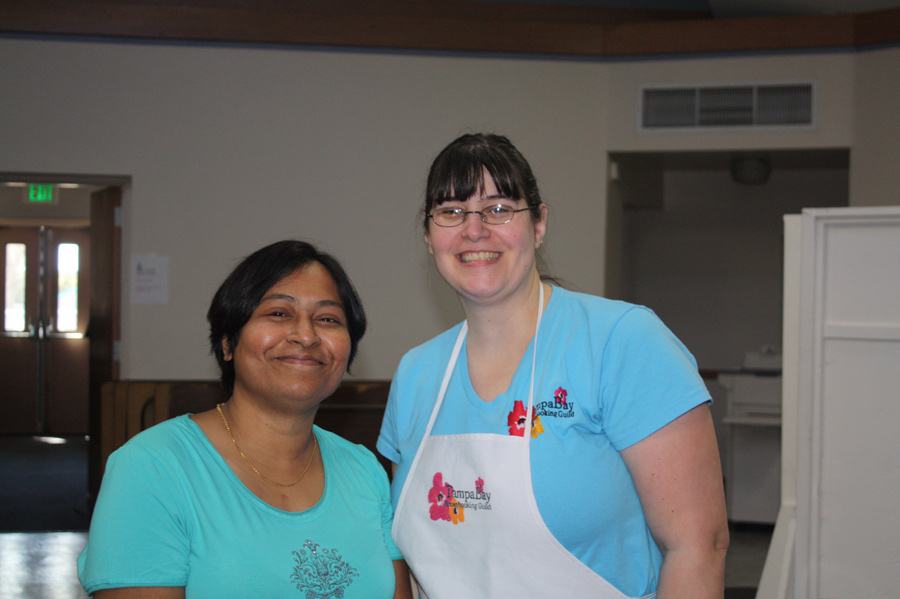
Thanks Mou for such a great workshop!!!


THE SIMS 2 VS. SIMS 3

Ok, so as promised here is my take on the subject of The Sims 2 vs Sims 3.  I know this is off the ususal topics for me but hey it's my blog and I can write about what I want.

To me The Sims is one of the best games ever.  I've been a fan of the the various versions of these simulation games for a long time.  I started with Sim City, graduated to Sim Tower, Sim Safari, Sim Town, The Sims, The Sims 2, Sim City Societies and now The Sims 3.  I always thought Sim City was fun, but limited, Sim Tower was a fave of mine for a long time until the The Sims came out.  I had all the expansions and could often sit, play and build for hours. I also loved that with The Sims you could download custom created content from other players.  When Sims 2 was released I was hesitant to make the switch.  I actually waited for over a year before getting it and loading it up.  I was hooked however from the start.  I purchased every expansion and every add on pack, plus downloaded an enormous amount of custom content.  The controls on Sims 1 were so limited in comparison, and with more building possibilities I never went back to Sims 1 again.  But now there is Sims 3, and while they have only released 1 expansion and 1 add on pack for this game, I still think a comparison can be made between the two base games. 

When you think of Sims 3, most people think that the new game must be improved from the other versions.  So what changed from S2?  Sims 3 promised seamless moving around town and from lot to lot, which meant no more tedious loading when going to another location as in S2.  As cool as it is to watch the taxi or my Sims car drive them around town, (you can even zoom in on them while driving), or watch them walk over to the neighbors house, there was a trade off for this.  Some of the locations that your Sims visit are no longer visible inside.  So places like restaurants, grocery stores etc. can be visited but your sim cannot be followed inside.  Instead you are given a menu of options of things that can be done on that lot, but you cannot see your sim actually do them.  This is limiting as now you can only have social interactions outside, since you cannot see who may be inside that you can meet up with. 

The second big change has to do with how the game loads now.  S3 definitely loads faster than S2 does, but what it loads is a family bin, not a neighborhood.  This is ok if you are just want to play your game, but what if you don't want to play a family and just want to build.  Building is one of my favorite things to do.  Even though it's all part of a game I find building sometimes can be a great creative outlet, and often turn to this when I'm in a creative rut with my conventional crafting.

How is it differnt? Mainly the difference in loading is that in S2 you loaded a neighborhood and from there you load either a family if you are going to play, or a lot if you are going to be building.  With S3 you no longer get the choice, you have to load a family, and then once loaded you need to go to your options menu and choose to edit the town.  You can build residential lots as well as community lots, but with not being able to go inside certain buildings anymore, there really isn't much point to building community lots.  

The third big change is the customization with your Sim.  Don't like the presets for the haircolor, no problem, you now have a color wheel to choose your own color, with additional customization for roots, tips highlights and main color.  So if you want your Sim to have bleach blonde hair with black roots, purple tips and red highlights, have at it.  You can also do this for clothing as well. The trade off is that the number of options for hairstyles is limited, and most of the clothes are horrible to start so customizing them really doesn't help much.  This was an obvious ploy by EA games to get you to purchase stuff from them since now the game loads through a new launcher which can pitches items from their store by tempting you with free stuff too. 

To be fair, I'm a little biased towards S2 because I have all of the expansions with some being good and some not so good.  I love the Open For Business expansion where you can create and run your own business and the Bon Voyage expansions where you can go on vacation or build your dream vacation home on the beach, but could have done without Pets and Freetime.  The expansions are usually what makes the game more interesting and fun to play. 

So what about S3 first expansion you ask.  It's called World Adventures, and hyped a great deal, like being able to travel to China, France or Egypt.  Bon Voyage for S2 was one of my favorite expansions but the places you travelled to were pre made locations, with the option to create your own "vacation" location as well.  Each location was like it's own neighborhood, with you could literally build from scratch.  World Adventures for S3 works a little different.  First, your passport allows you to only go on a 3 day trip to start regardless of the amount of money your Sims have.  If you want to go on a longer trip you are forced to participate in the adventures to game more points in your passport to allow a longer trip.  Even after you complete all of the adventures your passport still only allows a maximum stay of 7 days. To gain more points to get more days allowed on your passport however you may need to make several trips to an adventure location just to complete tasks.  The second thing that really bugs me about this is that in each of the places you visit it takes forever to travel from one lot to another.  You waste a lot of your vacation time just getting around.  Poor planning I think. 

Thirdly a lot of attention was paid to developing China, but Egypt and France were sparse in what they had to offer, leading me to a feeling that the product was rushed to put on the market for the holiday shopping season.  I admit I fell for it too.  Both the expansion and the base game were being offered at such great prices during the holidays, I put them on my Christmas list (I would have waited to move to S3 if the deal wasn't so good).  And while there are some fun parts to World Adventures mostly the whole expansion pack seemed lacking.   
The Big Picture:   So what do I think overall, where Sims 3 is fun, and the seamless transitioning between lots is cool, I can't help but feel that all the new things aren't worth the hype or the trade off's sacrificed for them.  Of course every person Sims differently so what I don't like about S3 may be the things another person loves.  But for me I still think S2 is for now the better game, even with the slower loading.  We'll see what the future holds for expansions on this game.  I'm waiting for them to knock my socks off with something never done before.
   

Well that's all I have for now.  I know there was no posting for the ATC 3.6.5. Challenge this time but I promise next posting I will catch up on with that.  I'm still making a card per day so there will be lots to show you.   As always comments are welcome so feel free to drop me a line.  Thanks for stopping by
and come back soon.

Thursday, March 18, 2010

What's new at The Loft - Episode 14

The 411 on Life at The Loft

Life seems to be keeping me very busy these days, which results in me finding I have less time to post lately.  The funny part though is that when I look back over the last few days since my last post I can't see where I've done much of anything artistically other than make my ATC every day.  I have been playing in photoshop a lot lately but don't feel like I've produced much worth commenting on.   Part of the problem has been my creative funk lately.  But I've signed up for a few new classes recently so hopefully this will be the trick to get those juices flowing.

Ok, so I confess, the artistic funk I've been in lately is not the only reason for my lack of creative output, it's also been my overwhelming desire to play Sims 3 which I got for Christmas but haven't had much time to play with.  So far it's ok, but I still think I like Sims 2 better.  Next post I'll write about the pros and cons of each.  I take my Simming very seriously, and I've found over the years that when I'm having an artistic block I ususally go back to The Sims, and do a lot of building.  Building new lots, I find, can also be a great creative release.

UPCOMING TAMPA BAY SCRAPBOOKING GUILD EVENTS

Saturday, March 20 we will be conducting our first workshop featuring a project called "My Wish For You". The workshop is being lead by Mou Saha. For more information on Mou click here. (Sorry Registration for this is now closed)


Our general Guild meeting for March will be Tuesday, March 30th @ 6:30 pm and will feature guest speaker Nancy Nally from Scrapbook Update. For more on Nancy and Scrapbook Update click here.

For more information on these two upcoming events or to sign up online you can go to http://www.tampabayscrapbookingguild.com/. Seating is limited so don't delay!


MY BIRTHDAY PRESENT

My birthday was a few months ago and my wonderful hubby got us tickets to go see Michael Bublé live in concert.  My husband doesn't really care for him but he is a sweetie and took me anyways because he knew I really wanted to go.  The concert was this past Saturday night and I had such a great time.  The show was fantastic and he is such an incredible singer.  I think hubby was even a little impressed, although he probably wouldn't admit it.  If you ever get a chance to see him live, I highly recommend it!!!   The show opener was a a group called Naturally 7,  who are an all a cappella group which they call "Vocal Play".  They were a very talented group of guys and enjoyed their portion of the the show as well.


ATC 3.6.5. CHALLENGE UPDATE

I'm still going strong on the daily ATC, but finding I'm spending a lot more time in creating them, which I think is taking away my time to do other things artistic.  While doing my card every night I'm finding that home, kids and life keep getting in the way, which in turn now takes me longer to do my card.  This then leads to obviously little or no time to do much of anything else.  However, daughter #1 has lost her enthusiasm for reviewing mom's cards so you will notice the A.R.'s are blank.


3/11/10 "City Streets"

For this card I started by cutting a background of some kite paper from Best Creations Inc. paper.  I cut a portion from just where the sky was showing.  Next I detail cut the shops shown on the left and right of the card from my scrabooking daily calendar.  I glued them down using a Tombow glue stick.  I then detail cut the traffic light, the taxi, the lady walking her dog and the woman in the hat and glued them down towards the middle of the card a bit, to give the card more perspective.  Next I detail cut the two larger women and adhere them to the card with pop up dots to give the card even more depth.  Lastly I added some white clouds I drew by hand using a white uniball gel pen.  A.R.

3/12/10  "On the Farm"  
My card from today was created by cutting a background from my Tweety Jill "Retro Roosters" pages collage pack, next I inked the edges of the card with Tsukineko chalk ink in midnight blue.  Next I used the chicken wire stamp from the Tweety Jill "Poultry Party"  stamp set and stamped it in black ink on the left side of the card.  After I stamped it however I didn't like how dark it came out so I cut out a picture of a barn and adhered it over most of the stamp.  Next I cut a small brown tag in my Cuttlebug and inked the top in Tsukineko chalk ink in turquoise and red brick to age it a bit.  Using the Tweety Jill "Poultry Party" stamp set I next stamped the chickens in Tsukineko chalk ink in Gingerbread,  the text was stamped in the brick red chalk ink the round label stamped in black ink, and the red checker board was stamped using Colorbox Cat's eye ink.  The tag was then edge in midnight blue chalk ink.  I then adhered the card to the right side of the card at an angle.  Lastly I detail cut the chicken and adhered it to the left side of the card using pop up dots.  A.R. 

3/13  "Sophisticated Lady"

For this card I started with some Tweety Jill paper from the "Retro Roosters" collage pack (blue/white polka dots) and used it as the background and then layered it with the french handwriting paper from Jill's "Travel to Paris" collage pack.  Next I detail cut the woman sitting from Jill's "Fashion" collage pack.  I topped off the card by adhering two prima flowers to the card with a rhinestone brad.  A.R. 

3/14  " believe"

To create this card I started by using my Neo II watercolor crayons to color the background  pink.  Next I took one of my photoshopped pictures of my daugher an adhere it to the left of the card.  I then stamped the title and the message with black ink.  Lastly I detail cut the two butterfiles and adhered them to the card with pop up dots.  A.R.    


3/15  "9:15"

I started this card by using a playing card for a background, to which I adhered a strip of pink handwriting paper taken from the Tweety Jill "Retro Roosters" collage pack.  The strip was adhered to the card in a diagonal across the card.  I next detail cut the woman from the Tweety Jill "Fashion" collage pack and glued her on top.  I then die cut a small tag using my Cuttlebug, and stamped a ticket from Jill's "Poultry Party" stamp collection in black ink.  I glued the ticket down at the bottom left of the card.  I then cut the number 15 from a Tweety Jill bingo card paper in the "Retro Roosters" collage paper pack and glued it on top of the ticket.  Lastly to give the whole card a more distressed look, I smeared Colorbox Cat's eye ink in bronze all over the top.  A.R.  


NEW MAGAZINE PAINTINGS & PHOTOSHOP PLAY

I have been playing around a little bit here and there, mostly in photoshop, but a little magazine painting as well.  Here is some of my recent work:


 "Girl Lounging"


"Girl with a Flower in her Hair" 

I took this photo a while back but just started playing with it for my last photomanipulation class. 


I love the tones of the photo of my daughter below.  I'm actually using this photo to do another manipulation that I'm not finished with yet, but this was the first result of playing.
Well that's all I have today.  As always your comments are appreciated so please feel to tell me what you think.  Thanks for stopping by and come back soon!

Saturday, March 13, 2010

What's new at The Loft - Episode 13


Sorry it's been awhile since my last posting.  Things have just been so hectic lately.  My printer which I loved will no longer accept any kind of coated papers so I have been doing research on new printers.  I finally ended up getting one on Saturday night after having dinner with some friends, but I haven't been able to try it out yet.  The printer cost significantly more money than the last printer, but I was fortunate enough to get it on sale.  The bad part was I couldn't see for myself what the photo quality was.  This is not something I would normally do but when I bought it, it was the last day of the sale and about 45 minutes until closing.  Luckily they have a good return policy so if it doesn't work out I can take it back.
Sunday I worked at one of our local scrapbook stores called Scraporium for the last day of the Tampa Bay Scrapbooking Treasure Hunt.  I was there to promote to Tampa Bay Scrapbooking Guild and to help with make and takes for the store.  It was a lot of fun and I got to meet a lot of nice people.

Tuesday night we had our montly Board of Directors meeting for the TBSG, and we had  a great discussion of our upcoming events.  Here's what we have coming up:

Saturday, March 20 we will be conducting our first workshop featuring a project called "My Wish For You".  The workshop is being lead by Mou Saha.  For more information on Mou click here.

Our general Guild meeting for March will be Tuesday, March 30th @ 6:30 pm and will feature guest speaker Nancy Nally from Scrapbook Update.  For more on Nancy and Scrapbook Update click here.

For more information on these two upcoming events or to sign up online you can go to http://www.tampabayscrapbookingguild.com/.  Seating is limited so don't delay!


ATC 3.6.5. Challenge update

Even though I haven't posted in awhile rest assured I'm still working on a card a day.  I had recently purchased more Tweety Jill collage packs, and love them so much, but the creative juices have been drained lately.  Even with all these great papers and images, I've found I'm a little tapped of my inspiration.  I'm feeling a little pressure lately to try and complete some things soon, which I think is adding to this creative block.  I've been so tired after working a full day which I think is also contributing.  Regardless I'm still happy for the most part with a lot of the cards I've created lately.

3/5  "Paris 1915"

All the images in this card are from my Tweety Jill collage packs.  I started with a sheet music background from the "Travel to Paris" collage pack and adhered it to the card.  Next I inked the edges with Tsukineko chalk ink in midnight blue.  I then detail cut the image from the "Fashion" collage pack.  The stamp in the upper right hand corner was also cut from the "Travel to Paris" collage pack, and was inked with Colorbox Cat's Eye ink in Red and then adhere with a tombow glue stick.  A.R. 2.5


3/6  "From Paris with Love"
I actually used a playing card for the base of this ATC even though it isn't visible.  I started by cutting a strip of brownish red with white polka dot paper from the Tweety Jill "Retro Rooster" papers. and adhered it to the left edge of the card.   I then cut the image of the Eiffel Tower from the "Travel to Paris" collage pack, and adhered it to the right edge of the card, overlapping the first strip.  I then took a french script stamp and stamped the bottom of the card at an angle using black ink.  I then inked all the edges of the card with Colorbox Cat's Eye ink in gold.  Next I cut a small tag from some light brown paper with my Cuttlebug using a Sizzick Big Bite die.  I then inked the tag with Tsukineko chalk ink in red and glued it down on the card.  The image of the woman was cut from the Tweety Jill "Fashion" collage pack and edge with Tuskineko chalk ink in brick red before I adhered it to the tag with pop up dots.  Lastly I added an epoxy sticker of a postal stamp. A.R. 3.0

3/7 "Cassidy in Oil Pastel"  
For this card I started with a black and white photo of my younger daugher and adhered it to the card.  Next I used a white oil pastel crayon and covered the entire photo. (Yes I said the entire photo!)  Next I started to color in the details with color.  I first colored in the hair and eyebrows with brown but when done I was not happy with how bright the brown was, so I blended it with some black.  I next added some blue for the eyes and red for the lips.  After that I colored in the skin with a flesh tone, and added some blue to the background.  I then added some detail and definition back in by using a fine tip marker to outline the eyes, lips, eyebrows, and face. Lastly I added a very light black line to the edge of the nose.  A.R. 2.0


3/8 "Balloon Adventure"
For this card I started with a background cut from the sky portion of a sheet of kite paper by Best Creations Inc.  The background was adhered to the card, and then stamped with a Tattered Angels large compass stamp.  I then edged the card in Tsukineko Chalk ink in Midnight blue.  Next I colored in parts of the compass with red, blue and yellow Zig markers, along with clear and rose star Gelly Roll Stardust pens.  Next I detail cut the hot air balloon from paper by Websters Pages, and inked the edges with Tsukineko chalk ink in red.  I lightly inked the top of the image with Tsukineko chalk in in turquoise and gingerbread to give it a more aged look.  I then adhered the hot air balloon to the card with some pop up dots.  Next I stamped the word adventure in black ink on white paper, and cut loosely around the word.  Using the same turquoise chalk ink I lightly covered the title, and highlighted the words in a rose star Gelly Roll Stardust pen, and edged the title in a clear Gelly Roll Stardust pen.  Lastly I adhered the title to the bottom of the card.  A.R. 3.0

3/9/ "Operators are Standing by"
To make this card I started with a background from some Tweety Jill collage paper.  To give it a more aged and distressed look I used Tsukineko chalk ink in gingerbread, brick red and turquoise and edged the card and smeared on the surface.  Next I cut a small tag from some light brown paper with my Cuttlebug using a Sizzick Big Bite die.  I then edged the card in the gingerbread and aged the face of the tag using the same combination inks as the background.  I then used a black fine point marker to draw a faux stitch line around the edge of the tag.  I then stamped the saying on the card using black ink. ( I love this stamp)!  I glued the tag down onto the card at an angle starting in the upper right edge of the background.  Lastly I detail cut the woman on the phone from Graphic 45 paper and adhered her onto the background slightly overlapping the tag. A.R. 4.5

3/10 "I'm Late"
Since buying the Tweety Jill "Alice in Wonderland" collage pack I have been wanting to use it and make some ATC's but the creative vibe was not grabbing me a first, so I put this pack to the side for awhile.  But the desire to make an Alice ATC was too strong and I was deteremined that I would make one this week no matter what, and here it is.  I started by cutting the background out of the collage pack, it was ATC size so no trimming was necessary, so all I had to do was glue it down with some Tombow glue stick.  I then edged the card with Color box Cat's Eye ink in lime green and yellow.  Next I detail cut the image of the rabbit from the collage pack and adhered him to the background off to the left side.  I then used a metal rimmed tag and glued an epoxy clock sticker to the top of it.  I adhered the clock using Glue dots.  I then stamped the title with some mini wood mounted alpha stamps.  A.R.

RECENT PHOTO WORK & PHOTOSHOP PSE 7 PLAY

My photomanipulation class is done now, but it doesn't keep me from playing around in Photoshop or messing with my camera.  Below are just a few things, but if you'd like to see more, check out my flickr page.  Here's some of my recent fun:   


I love the retro look in this photo of my older daughter.  It reminds me of my old family pictures from the 70's.   I haven't enhanced the photo in any way digitally, and the effect was created by simply covering the lens with red saran wrap.   Since the saran wrap isn't quite clear, it gives it a more grainy look.

I used a gaussian blur effect to the background to enhance and bring attention to the living tree at Disney's Animal Kingdom. 


Here's a digital collage of my husband and daughters created using several transparent layers and an added texture layer.


That's all I have for now.  Your comments are always appreciated so please feel free to drop me a line and let me know what you think.  Thanks for stopping by and please come back soon.

Friday, March 5, 2010

What's new at The Loft - Episode 12

P.S. on my last post "Farewell Vancouver 2010"

In my last post I stated that I wasn't dazzled by the Vancouver opening ceremonies but I completely forgot about the fantastic performance of Leonard Cohen's Hallelujah by K.D. Lang (click to watch the video) of Leonard Cohen's Hallelujah.  I've been a fan of hers for a long time.  She is an incredible singer/songwriter with a voice like no other.  For those who have never seen or heard her before, this was a great venue to showcase her amazing talent.

A.T.C. 365 Challenge update

Daughter #1 wanted to get in on the action of rating the cards so for the month of March, we will be switching to an A.R. format (Ashlyn Rating).  So after each description it will show a Ashlyn's rating for that day's card on a scale of 1 to 5, 1 being the worst and 5 being the best.


My card from 3/1 is called "The Reveler" and for this card I tried a different technique to create the background.  I used some of the scraps of Glimmer misted coffee filters that I used to create my card "Spring Flowers" from 2/24 (see posting for Episode 10).  I cut these scraps into small square and rectangular pieces and layed them down onto the card, similar to how they teach kids to make paper mosaics in 1st grade.  I glued the filters down in no patricular color pattern, and allowed the pieces to overhang the edge of the card.  When dried I trimmed the filters to fit the card.  Next I took gold Cat's eye ink and inked around the edges of the card.  I then detail cut the image of the Mardi Gras reveler from a magazine and glued her on top.  I then stamped the Fleur de Lis in black in at the bottom, and topped off the card by spraying pearl Glimmer mist over the top for a little extra shimmer. A.R. 3.0


My card from 3/2 is called "Hotel de Paris".  To make this card I started with a playing card that was lightly sanded for better adhesion, and cut the image of the Arch de Triomphe from the Tweety Jill "Travel to Paris" collage pack and adhered to the playing card as the backgroung.  I then inked the edges with Tsukineko Versa Magic chalk ink in midnight blue.  Next I then cut a small tag with my Cuttlebug die cutter out of some Tweety Jill paper that looked like old parchment. I inked the edges of the tag with Distress ink in walnut and used Tsukineko Versa Magic chalk ink in aqua and red and lightly added a little color to the top of the tag.  Next I used some sepia ink and stamped a french postal type stamp to the upper right hand edge of the tag an black ink to stamp a small postage stamp on the bottom left of the tag using an imperfect stamp method.  The title was cut from some DCWV travel paper and glued down.  Lastly I punched a hole in the bottom right of the tag and inserted an Eiffel tower brad, and tied some blue ric rack ribbon to the top of the tag.  The tag was then adhered to the card with some pop up dots.  Finally I stamped a Fleur de Lis on the bottom left of the card.  A.R. 4.5


My card from 3/3 is called "Country Kitchen" and I started this card again with a playing card as a base.  I lightly sanded the card for better adhesion of the glue and cut a piece of background paper from my Tweety Jill paper pack that looked like old distressed paint.  Next I inked the edge of the card with Distress ink in fired brick.  I then cut a small advertisement for pears from some Graphic 45 paper (Domestic Goddess collection) along with some small squares of fruit that were on the border of the paper.  I glued the advertisement to the middle of the card at angle, and the fruit squares were glued at the bottom.  Next I stamped the chicken wire stamp from my Tweety Jill "Poultry Party" stamp collection with black ink at the bottom over the adverstisement and one of the squares.  I next took a vellum wire rimmed tag and inked the inside with Distress ink in tea stain to age it, then stamped the round design with a another stamp from the Tweety Jill "Poultry Party" stamp collection.  I topped the tag with some brown checked ribbon and adhered it to the card with glue dots.  Lastly I detail cut the cherries and adhered them to the card with pop up dots.  A.R. 3.5

My card from 3/4 was called "Eyewitness to Tragedy"  and for this card I tried something a little different.  My normal process is that I find an image or background I like, or a technique I want to try and build from there.  For this card I pretty much started out blind, other than I knew I wanted to do an altered art piece.  I began by painting the background of the card with red Basics acylic paint.  I then found the image of the girl and glued her to the card.  I didn't really have a concept or plan yet so next I dry brushed white paint on the image of the woman and then did a little outlining with a fine point black marker.  When I went to do one of the eyes I really messed it up, so I took my Crop O' Dile and punched a hole where her eye should go.  In looking at all my brads and eyelets I found the camera and thought that might be neat but I still didn't have a clear plan.  As I was doing this my daugther pulled out a decorative button of the Twin Towers and the lightbulb went off.    Immediately the concept became clear.  I've never been one to do pieces that have a lot of symbolism  I'm not that deep a thinker and take a more the straight forward approach to my projects, but when the concept revealed itself this card became all about symbolism.  The camera is one of the tools used to capture the tragedy, the white covering the woman is no longer paint, but became a woman covered in ash, the towers which stood so tall, and the red of the background now symbolizes the fire and blood.   As one of many thousands who were so changed by the events of Sept. 11, 2001 this served as a reminder even to myself that it doesn't have to be the anniversary of that tragic day to remember the fear, loss and devastation we shared as a nation. Something as simple as a decorative button can remind us to "never forget"   A.R. 4.0 (since Cassidy finding the button served as the inspiration she rated the card too.  C.R. 5.0)


Update on Daughter #1's Room Redecoration

As promised from my last post, here are some pictures of the room with the second coat (the dark purple) that we put on the paintable wallpaper.
It's hard to see the white chair rail moulding separating the 2 new colors.  This is going to be repainted soon, most likely in black, but possibly a dark gray.

Here's what the new walls look like together with the new comforter, which was the inspiration for the new color scheme.  It's a reversable comforter that is all black on the other side.


Ashlyn posing next to the new wall color.  I think she is starting to like how this is coming along.  

Visual Poetry Photomanipulation Week 4 with Susan Tuttle

I just completed my assignments for my last week of this great class.  It has been a fantastic experience and I've learned so much.  I can't wait to apply some of the techniques learned to some of my other photos.

Lesson 1 this week was called "The Significant Object", and it was about how to apply a selective recolor to bring color back to an area or object after a color photo has been turned to black and white to draw the eye to one place or object.  I had taken a previous class in some digital photo techniques, but Susan's method was much easier and I think provided more dramatic results.   

Here is my before photo

Here is the after photo

Lesson 2 this week was called "Faux Midnight"  and it taught us to create a photo that gives the subject the appearance of being night time with a moonlit illumination. I'm not sure I was entirely successful in the application of this lesson, but I was happy with the photo results even if it didn't exactly come out like the lesson intended.  I definitely didn't take the photo as dark as I needed to in order to achieve the true faux midnight feel, but I liked the dramatic change in the photo.

Here's the before photo


Here is the after photo

Lesson 3 was called "Landscape Atmosphere" and taught us how to create mood and atmosphere in landscape photos.


Here's the before photo


Here's the after photo


This class has been such a great experience and I highly recommend it to anyone who has a basic knowledge of Photoshop Elements.  Susan Tuttle is a great teacher and if your interested in learning more about her you can read her blog here or you can visit her website here.  I can't wait for more of Susan's classes.
 
To see more photos that I've changed using some of Susan's techniques or to just see some of my other photomanipulation work please feel free to visit my flickr page. 
 
Well that's all I have for today.  Comments are always welcome so please feel free to drop me a line.  Thanks for stopping by and come back soon!

Wednesday, March 3, 2010

What's new at The Loft - Episode 11

Farewell Vancouver 2010

On the whole the games were great to watch, and our athletes did great.  I wasn't dazzled by the opening ceremonies like I was for the Beijing games, but the human interest stories NBC presented really highlighted not only what a beautiful city Vancouver is, but Canada itself.  I grew up on the boarder of Canada, and I felt a new found appreciation for the country and it's people.  To my regret I decided to not watch the closing ceremonies, instead I watched the gorgeous Rupert Penry-Jones in "The 39 Steps" on my local PBS station.  I didn't regret watching the movie as it was really good, but I should have set my DVR for that and watched the closing ceremonies, since it had Michael Bublé AND and he was dressed like a Mountie. You can't get any better than that!  If you were a fan of Due South you'll know what I mean.  I was glad I was able to catch a video of his performance the next night though. Click here to watch the closing ceremony video.  All this just added to my excitement of going to see Michael in concert on March 13th, which was a wonderful birthday gift from my hubby.

Sadly now though the Olympics are over, which means there won't be any curling to watch for a while except for some odd match being played on one of the sports networks in the wee hours of the morning.  (Side note: check out this video of Michael Bublé being taught how to curl ).   I'm sure if the US team had done better things might be different, perhaps instead of graveyard shift curling it may have been bumped up a notch to a shot on a Sunday afternoon on a one of the lesser watched sports channels.  But sadly the US team men's and women's team didn't just do badly, they were down right awful.  Beyond the US teams disasterous performance, some great curling was played.  The Canadian mens team was awesome, and played with great skill and precision.  What a treat to watch!  And who could forget the funky pants of the Norwegion mens team.  Love it!  Hopefully the overall higher profile of the sport during the 2010 games will bring more fans on board.  I can only hope as 4 years is entirely too long to wait.


ATC 3.6.5. Challenge Update

Still going strong with my ATC per day.  2 months down and only 10 more to go.  LOL!

My card from 2/26 is called "The Queen".  This was such a fun card to create.  First I started by cutting a background from a scrap of Websters Pages vellum.  I then detail cut the curtains and the child from a children's book called Tea for Ruby.  The book was written by Sarah Ferguson, Duchess of York.  I don't normally approve of cutting up perfectly good books (old falling apart ones are ok), but the illustrations in this one were wonderful and the book was free ( it came in a box of Cheerios).  I decorated the curtains with some Neo II watercolor crayons, adding only a little water in some spots making the color deeper in other areas.  Once dried I glued it down on top of the background.  I then close cut the little girl and adhered her on top of the curtains with some pop up dots.  I then cut the title out of a page of the book and also adhered with some pop up dots.  C.R. 5.0


My card from 2/27 is called "Music in my Heart" and was made starting with a playing card as a base.  I next sanded the card to distress it and give it a little more tooth to hold the glue.  Next I took a piece of striped paper for a KC and Company paper pack I had and cut a strip and inked the edges in Tsukineko Versa Magic chalk ink in gingerbread, then I added some Distress ink in Walnut ove the top of the chalk ink for a little more pop.  The strip was then glued onto the card so the stripes were displayed diagonally.  Next I ripped a strip from some red polka dotted paper and inked the edges with Distress ink in fired brick.  I glued this strip down in a vertical line along the right edge of the card.  Next I detail cut the lady from my Tweety Jill collage pack and glued her on top.  I then topped it all off by stamping the musical notes on top in black ink.  C.R. 3.5

My card from 2/28 was called "Beware of Pirates" and is the product of a Tweety Jill, make and take at Scraporium, a local scrapbook store, for the annual Scrapbook Treasure Hunt here in our area.  Jill was on hand herself to conduct the make and take, so I took my youngest daughter along for some creative fun.  We started with a playing card that was covered in Tweety Jill collage paper with a  tall ship on it.  I then took a small tag and inked the edges with some brown chalk ink and brushed a light blue ink in in the center of the tag.  These tags were great because they already came in a aged tea stained color.  Next I stamped a small sea horse in an orange color ink and a star fish in a brick red ink onto the tag.  I then stamped some words in black at the bottom of the tag, and the round stamp at the top in black ink. I topped off the tag with a gold ships wheel.  The tag was then adhered to the card with pop up dots.  The skull and cross bones where then detail cut and glued down on the other side, and I added a red sequin to the eye.  C.R. 5.0.

After the make and take Cassidy had her picture with Captain Jack who was hanging out at the store during the Treasure hunt.


Birthday Party

We had a birthday party for our youngest daughter Cassidy over the weekend.  It was her 7th.  We invited a small group of friends to Build-A-Bear for a beary good time. I can't believe I just typed that.    Here's some photos of the fun.


The Birthday Girl


Party Time


Lining up for the autograph bear


Daddy Dearest


Big Sister Ashlyn


Cassidy with her new friend, Hello Kitty


Update on Daughter #1's redecoration project

With the wallpaper now, we decided on a color and got the paint.  It's a dark raspberry.  Here's some pictures of what it looked like after the first coat. 


We learned some very important lessons with this part of our painting job.  
     First:  Frogtape's green painters tape is great for walls, not for wallpaper or moulding.  It will take the paint off the moulding, and sticks to the wallpaper too much, and actually ripped it in some places.  Althouhg it probably would have helped if I had read the "How To's" on their website first. 

    Second:  Pad type edgers are useless on paintable wallpaper.  Since there is no tooth to the wallpaper all it did was smear paint instead of actually painting anything. 

   Third:   We learned that it was better to put a coat on and let it dry, and then go back over to get the spots you may have missed.  Again because there is no tooth to the wallpaper you can't touch up spots you've missed while the paint is wet,it just smears.  Once we let the first coat dry we then put the second coat on, but I'll post pictures of that next time.


I've also just finished my photomanipulation class and will share my final photo's with you next time.  As always your comments are welcome so please feel free to drop me a line and let me know what you think.  Thanks for stopping by and come back soon!