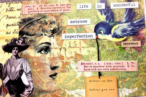
Hello
Everyone,
My apologies for my absence of late. We have had a serious health crises in our family which
has led to a major shift in the way our family lives now. As bad as things were
at the time, we are fortunate and very grateful that by the grace of God we
were given a second chance to continue on this wonderful life journey together as a family. Thank you to all those who have given us their support,
well wishes and prayers during these challenging times. Life around here
is returning to what we know now as the "new normal", and I appreciate your patience and understanding. Now on to happier creative thoughts!

As I mentioned in my last blog post I recently participated in iHanna's DIY postcard swap. I love participating in these art swaps because
it gives me an opportunity to do some creative play with paper and mixed media
collage. And while there is no
limitation on the type of art you can create for the swap, other than it being postcard size, I
chose to collage my postcards.
I have done this particular swap a few times now and after making roughly 30 postcards for it, I began to notice that there were similar traits in
all my cards. On even further reflection I
realized that the similar traits were due to a simplified approach and work
flow to the creative process I used to make my collaged cards. This
simplified approach is my comfort zone, a starting point in which I can build
off of when later I’m doing larger works in my art journals or even canvas wall hangings. So here’s my go to formula for making colorful, vintage, girly
postcard collages:
Step 1: I start with a
busy but simple background. I like to use maps, dictionary pages, sheet music,
newspapers or magazines (foreign and domestic), the white pages or any papers
with script. Scrapbooking, Origami
or wrapping paper also make for great backgrounds. For
something a little more personal especially in art journals, I keep a small stack of my daughters
returned homework, old greeting cards, postcards or old shopping lists. I also like to use found items like travel
brochures, recipe cards from the grocery store, and even discarded corrugated cardboard.

I start by tearing off large pieces of the background papers, usually 3 -5
different background papers and glue them down overlapping the edges of the
papers to add some texture. Also I typically
glue my background papers down so that they overhang the sides and trim them down
later which I think gives the background an even more random collage
look. The great thing about this is that if I’m not
happy with the background, I can keep adding more visual interest by adding
more bits of background papers. Other
things you can try are to stamp over the existing background. I like using word
stamps, flourishes, texture stamps or border stamps. However depending on the types of papers
already laid down its better to use stamps that will complement those papers
not detract from them. For example if I
have papers with words, I would choose a flourish or texture stamp. In addition you can also try doodling, rub-on
elements or stencils to add more visual interest. Remember there is no right or wrong, only
what you are happy with.


Step 2: Once I am
satisfied with the background, I glue this down. For paper collages I like to use the Elmers Extreme Glue sticks or a gel medium, either Golden or Liquitex. I used to use the Scotch craft glue sticks but found that while the initial adhesion on these was good, over time some of the glue would weaken. I then trim away all the overhanging pieces of paper.
Step 3: Next I search for a focal point image. I like to choose images that are the opposite of what was used for a background in terms of color. For example if I used mostly muted or pastels on the background I will choose an image that is of bolder colors, black and white or monochromatic. I usually choose images of people or animals. The image depending on size can be left as is or detail cut. I DO NOT glue down the focal point image yet because I generally add some other interesting imagery around it as described in Step 4.
Step 3: Next I search for a focal point image. I like to choose images that are the opposite of what was used for a background in terms of color. For example if I used mostly muted or pastels on the background I will choose an image that is of bolder colors, black and white or monochromatic. I usually choose images of people or animals. The image depending on size can be left as is or detail cut. I DO NOT glue down the focal point image yet because I generally add some other interesting imagery around it as described in Step 4.

For this card I chose to detail cut the image below

Step 4: Choose additional visual imagery to
enhance the foreground which work to compliment the focal point image and then to
draw the eye around the rest of the postcard.
I like images of flowers, clocks, postage ephemera, birds, butterflies and
even buildings. Patterned Washi tapes,
parts of playing cards, ticket stubs and even images found on junk mail work
well here. Again I'm still playing with the exact layout so I don’t glue anything down yet.


I really liked the burst of color from the flowers so I detail cut them.

Step 5: Inevitably in
cutting magazines, brochures or other sources of imagery I’m always left with a
ton of little scraps. I have a habit of
going through my magazines and brochures when I’m working on a card, and just
pulling out pages that have a focal picture that appeals to me, but very rarely
do I use the whole page or the whole image.
And since I also do a lot of detail cutting of smaller images from
bigger ones, I also make sure I save the little scraps that are leftover until
I am done with a project and will not be in need of them. Little scraps of paper can act like a ribbon
embellishment when working with fabric. By taking a closer look at the pages of the
source material you will be amazed at what can be so easily overlooked. Flourishes, doodles, emblems, thumbnails or
logos are just some of what you can find by taking a closer look at source
materials you can use for your collages.
Even scraps with texture images cut into slivers and included around
edges or around your focal point image can help move the eye even more around
the whole piece.

For this card I chose a scrap that would add another pop of color, one that looked like planked wood and a small image of a half of a compass.

Step 6 – I won’t deny that I am a big perfectionist, so it should be no surprise when I admit that I will layout my collage arrangement and rework it many, many times before I glue anything down. Only until I am truly satisfied will I glue the focal point image and any additional images or embellishing imagery down.

Here is he card after everything is laid out an glued down.

Step
7: Include a message - Whether it be
something short and sweet or a favorite quote I almost always include some sort
of message when I create a collaged postcard.
Sometimes I print and cut them out, sometimes I use ones I’ve found in
magazines or I use preprinted word stickers to create messages. Tim Holtz makes a great book called Small
Talk stickers that has lots of different words that come in black, white and kraft paper versions for you to create a custom
message. Depending on the message I may
even stamp them out using a mini stamp set.
Mini wooden font stamp sets are very inexpensive at Michaels in the
scrapbooking section or in their dollar section. They are usually thrown in with the small
acrylic stamps and can usually be found in different fonts in upper or lower
case letters.
Tim Holtz Small Talk stickers

and here is the postcard all done.

Magazines - I find some great imagery in magazines like Daphne’s Diary, Somerset Digital Studio, Stampington’s Artful Blogging, Stampington’s Artist’s Café and Watercolor Artist. The price tag for most of these magazines is pretty steep as magazines go (about $15.00 each) so I wouldn't choose these unless you like to read them. I will typically by a Somerset Digital Studio magazine once every two years or so then go to town destroying them for the imagery only. Other not so expensive magazines work well too. I like The Knot (bridal magazine), Southern Living and Harper's Bazaar. For the more frugal of journalers AAA members receive a free magazine every month which I love for imagery, but going online and requesting catalogs from Pier One, Anthropologie, and Pottery Barn can also reap great finds too.
Bargain Books - I once thought it was a sacrilege but now
for me it’s nothing to buy books from the bargain book section at my local
book store just for the purpose of scavenging imagery or text from them. Charity or thrift stores along with book
sales at your local library can also yield great resources for imagery and background papers like from old atlases and encyclopedias etc. Our local
library even gives away old magazines like National Geographic from time to
time.
“Unconventional”
resources to use for background papers - yellow
or white pages, old calendars, catalogs, old user/owner’s manuals, newspapers, junk mail and even labels from food packaging can be fun.
A note about food packaging - Because of the risk of foodborne illness, do NOT use any packaging that has touched food directly or is suspected to have come in contact with food directly/. Never use packaging from meats, egg, dairy or fresh vegetables of any kind. Labels from bottles, cans or boxed goods are usually safe but examine everything carefully. If it looks suspicious do not use it. Some foodborne illness don't necessarily have to be consumed to make someone sick. Always side with caution.
On the Road - If you are like me and bring an Art Journal and some art supplies while travelling, then you know that taking a large image library is not generally an option. When I collage or Art Journal on the road I make it a point to not bring imagery with me. Traveling is a great opportunity to collect great source materials and imagery. When I’m traveling I keep on the lookout for travel brochures, local street maps, ticket stubs and menus or other guides or literature about the place you are visiting. Once my husband even brought me home a Japanese newspaper that he found abandoned at an airport while he was traveling. It’s amazing what great imagery you can get for free when you travel. I even collected fantastic imagery of animals from a small publication that was freebie at a convention center where they were having a quilting convention. To my husband's dismay I tend to come home with a lot of useful additions for my stash when I travel.
It's easy to fall into the trap of buying a lot of materials for art journaling and collage but there is so much out there that you can use that is free or very low cost. Sometimes it's just a matter of looking at things in different ways.
A note about food packaging - Because of the risk of foodborne illness, do NOT use any packaging that has touched food directly or is suspected to have come in contact with food directly/. Never use packaging from meats, egg, dairy or fresh vegetables of any kind. Labels from bottles, cans or boxed goods are usually safe but examine everything carefully. If it looks suspicious do not use it. Some foodborne illness don't necessarily have to be consumed to make someone sick. Always side with caution.
On the Road - If you are like me and bring an Art Journal and some art supplies while travelling, then you know that taking a large image library is not generally an option. When I collage or Art Journal on the road I make it a point to not bring imagery with me. Traveling is a great opportunity to collect great source materials and imagery. When I’m traveling I keep on the lookout for travel brochures, local street maps, ticket stubs and menus or other guides or literature about the place you are visiting. Once my husband even brought me home a Japanese newspaper that he found abandoned at an airport while he was traveling. It’s amazing what great imagery you can get for free when you travel. I even collected fantastic imagery of animals from a small publication that was freebie at a convention center where they were having a quilting convention. To my husband's dismay I tend to come home with a lot of useful additions for my stash when I travel.
It's easy to fall into the trap of buying a lot of materials for art journaling and collage but there is so much out there that you can use that is free or very low cost. Sometimes it's just a matter of looking at things in different ways.